
The Show Hockey Tournaments Unveil Updated Logo and Brand Identity
We are excited to announce that The Show Hockey Tournaments have updated our logo and brand identity. While keeping the classic elements our community loves, we've made subtle enhancements to give our brand a fresh, modern look.
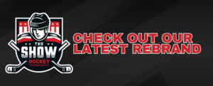
A Fresh Look with Classic Elements
Our new logo retains the iconic features that have become synonymous with The Show Hockey Tournaments. The bold colors—red, black, and white—remain, symbolizing the energy and competitive spirit of our tournaments. The updated design introduces a streamlined hockey player, featuring cleaner lines and a modernized helmet, enhancing the logo's contemporary appeal. The sticks and stars are more prominently displayed, adding balance and symmetry to the overall design.
The Reason Behind the Change
The decision to update our logo reflects our commitment to staying current and relevant in the fast-paced world of hockey. As we continue to grow and attract top-tier talent, this new logo represents our evolving identity while recognizing our past.
Moving Forward
This logo update is more than just a visual change—it's a statement of our dedication to providing exceptional experiences for players, coaches, and families. You'll see the new logo prominently featured in our upcoming tournaments, on merchandise, and across our digital platforms, ensuring a cohesive and recognizable brand presence.
Stay tuned for more exciting updates and initiatives from The Show Hockey Tournaments as we continue to lead the way in amateur hockey.